


Designing a space for individuals with dementia requires careful consideration of color and design. Here are some dementia-friendly colors and designs to consider:
- Use contrasting colors: High-contrast colors can help individuals with dementia distinguish between different objects and areas. For example, using a white toilet seat against a darker colored floor can make it easier to locate.
- Avoid busy patterns: Busy patterns can be confusing and overwhelming for individuals with dementia. Instead, choose simple patterns or solid colors.
- Choose calming colors: Calming colors such as blues and greens can help create a sense of tranquility in a space. Avoid bright, bold colors, which can be overstimulating.
- Use natural lighting: Natural lighting can help regulate circadian rhythms and improve sleep patterns in individuals with dementia. Use curtains or blinds to control the amount of light coming into a room.
- Use clear signage: Clear signage with simple symbols or images can help individuals with dementia navigate their surroundings more easily. Make sure signs are large enough to be easily visible.
- Provide visual cues: Visual cues such as photographs or artwork can help trigger memories and create a sense of familiarity in a space.
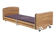
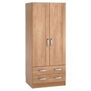
- Create a homely environment: Use familiar objects and furniture to create a homely environment that feels comfortable and welcoming. Avoid large, institutional furniture that can be intimidating.
Overall, designing a dementia-friendly environment requires careful consideration of color, pattern, lighting, and signage. By creating a space that is easy to navigate and promotes a sense of calm and familiarity, individuals with dementia can feel more comfortable and supported.